Choose a readable font
If you use a computer, you will have access to a wide range of fonts (also known as typefaces). Fonts are generally grouped as 'serif' or 'sans serif'.
|
Serif fonts have a small projection at the end of each stroke in a letter. |
Word |
|
Sans serif fonts don't have this projection. ('Sans' is French for 'without'. |
Word |
While there are no rules for which fonts to use, there are widely accepted practices.
Serif fonts are considered better for printed documents where there is a lot of dense text to read, such as in lengthy reports. The serif example in the box above is Times Roman.
Sans serif fonts are considered better for well-spaced text (like this document), headings and websites. The sans serif example above is Arial.
When selecting a font, especially for documents that will be read online, it's a good idea to check whether it is available on both Windows and Mac computers. [1] If you're not sure which fonts to use, experiment with these common ones: Times Roman and Georgia (serif), and Arial and Verdana (sans serif).
Avoid using more than two different fonts in a document, as this can be distracting for your reader.
Make the font large enough
For best results, use at least 12 point text because it is easy to read.
Make important points stand out clearly
When you want to emphasise a heading or a paragraph of text use a bigger size,
bold or a different colour.
Don't use all capital letters (also called upper case) to make points stand out. AS YOU CAN SEE FROM THIS EXAMPLE, THEY CAN BE DIFFICULT TO READ AND MAKE IT SEEM THAT YOU ARE SHOUTING AT YOUR READER!
Use left aligned text
Left aligned text is where the content is lined up with the left margin of the page (like the text on this page). It is also known as ragged right text. This is the easiest to read for most documents.
Justified text is where the text is distributed evenly between the margins. Avoid justified text because it can lead to large gaps between words, which makes sentences difficult to read.
|
Justified text |
Left aligned (or ragged right) |
| Try not to justify text, as this can lead to large gaps between words. It is best to use left aligned text. Also, be generous with your margins. |
Try not to justify text, as this can lead to large gaps between words. It is best to use left aligned text. Also, be generous with your margins. |
Images can help
Images, graphs and tables can complement and offer a break from large amounts of text. When you use them thoughtfully, they can be a great way to emphasise important facts and figures. Place them near the relevant text and make sure they genuinely help explain it. Remember your reader though. Some people are not familiar with graphs like pie charts and bar charts, and may not understand how they work.
Watch your line spacing
Line spacing refers to the amount of space from the bottom of one line of text to the bottom of the next line. Too little space and the reader will miss lines. Too much and the reader may be unsure if the lines of text refer to each other. You can adjust the line spacing in a Word document through the paragraph settings. The numbers in brackets in the examples below show the different line spacing used.
Too little (1.0 or single)
Plain English is a way of presenting information that helps someone understand it the first time they read or hear it. It allows them to get the information they need, understand it easily and act if they need to. |
Suitable (1.15 spacing)
Plain English is a way of presenting information that helps someone understand it the first time they read or hear it. It allows them to get the information they need, understand it easily and act if they need to. |
Also suitable (1.5 spacing)
Plain English is a way of presenting information that helps someone understand it the first time they read or hear it. It allows them to get the information they need, understand it easily and act if they need to. |
Too much (2.0 or double spacing)
Plain English is a way of presenting information that helps someone understand it the first time they read or hear it. It allows them to get the information they need, understand it easily and act if they need to. |
Avoid background images
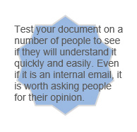
Avoid using background images behind text. Many organisations use illustrations as a background image. This makes text harder to read, especially if the background image is very colourful.

Use good quality paper
Many types of paper are used for printing and each one reacts differently to ink. The best quality paper is 'uncoated'. Because of its surface, it takes ink well, which improves readability.
The other benefit of uncoated paper is that it does not reflect light. Documents printed on uncoated paper are easier to read because there is no glare from the page.
Have a good contrast
White or light cream paper usually makes your text most readable. But you can use a light coloured paper or a solid background colour to make your publication more colourful. For best results, make sure there is a strong contrast between the text and the background.
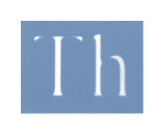
| When you use light coloured text on a dark background, use a bold font. This helps prevent the problem of ink filling in parts of the letter. This happens most often with a serif typeface. |  |
Watch out for shadowing
Make sure your paper is heavy enough to avoid images or text on one side of a page being seen through the paper. This is known as 'shadowing' and makes reading difficult. Standard office documents tend to be printed on paper weighing 80 gsm (grams per square metre). You may need a heavier weight if you have images that show through. Ask your paper supplier for advice, as some paper is more transparent than others.
Use colour and shading with care
Graphics and photographs that have big blocks of colour and shading use a lot of download and storage space on computers. They also need a lot of ink to print out. If you know your reader is likely to have a basic computer and printer, come up with a design that makes it affordable and easy for them to download and print.
For more information, see
http://web.mit.edu/jmorzins/www/fonts.html,http://www.3cstudios.com/WebsafeFonts.aspx.